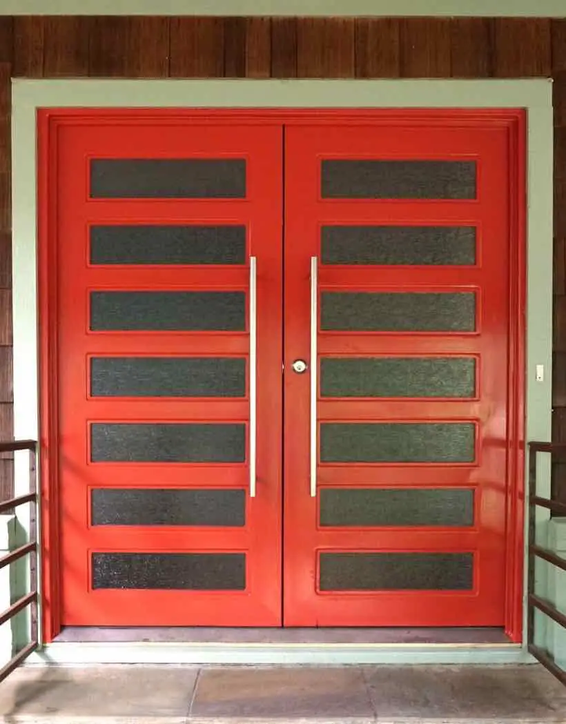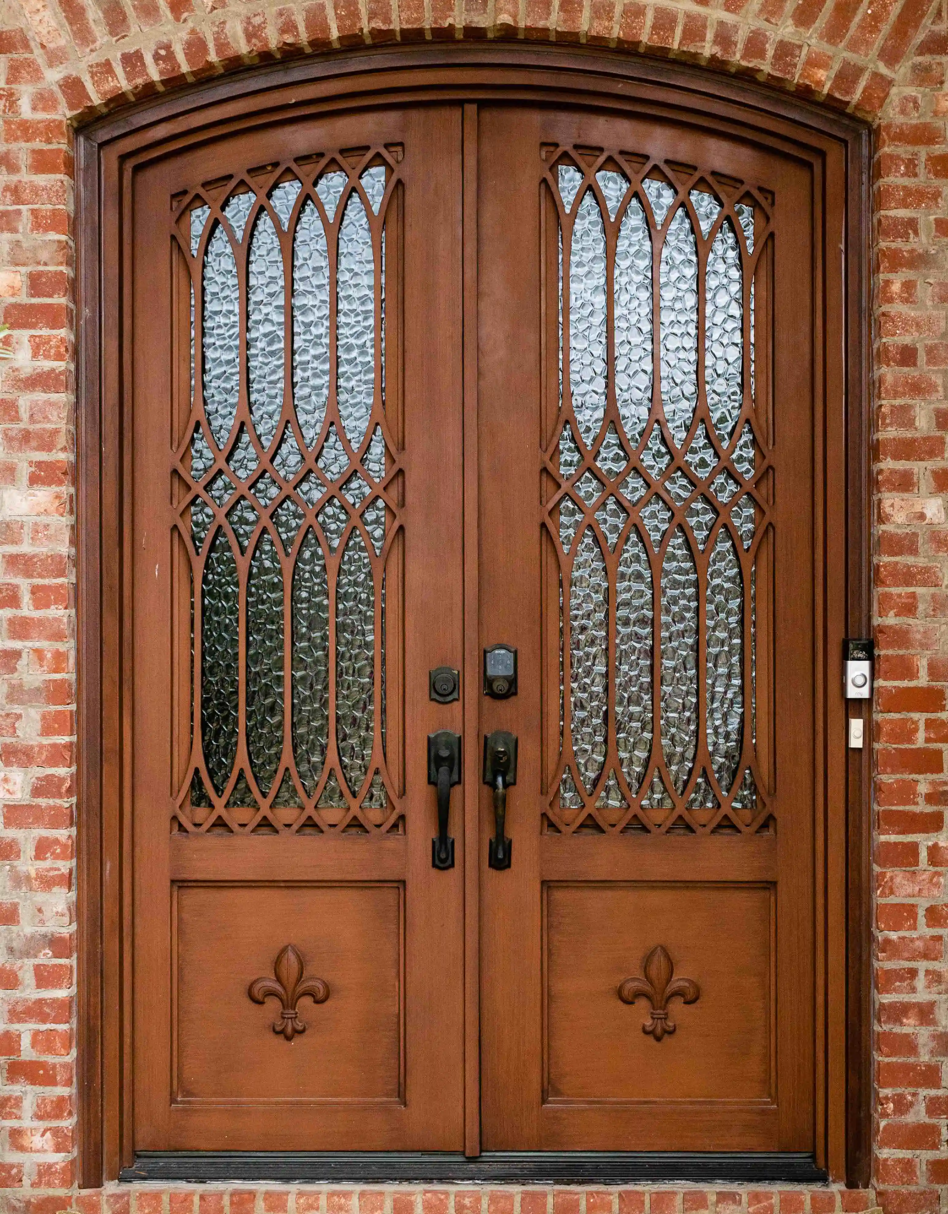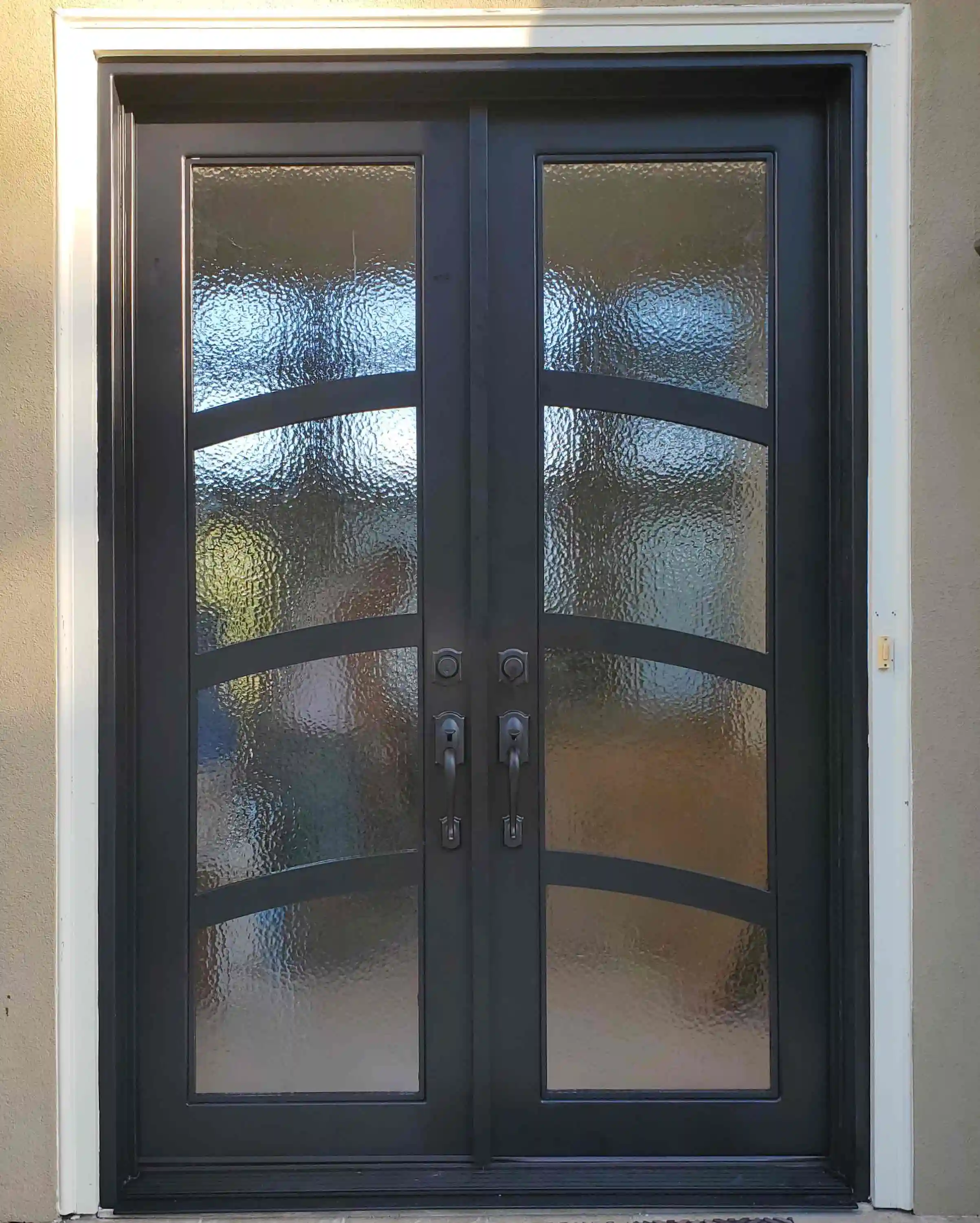
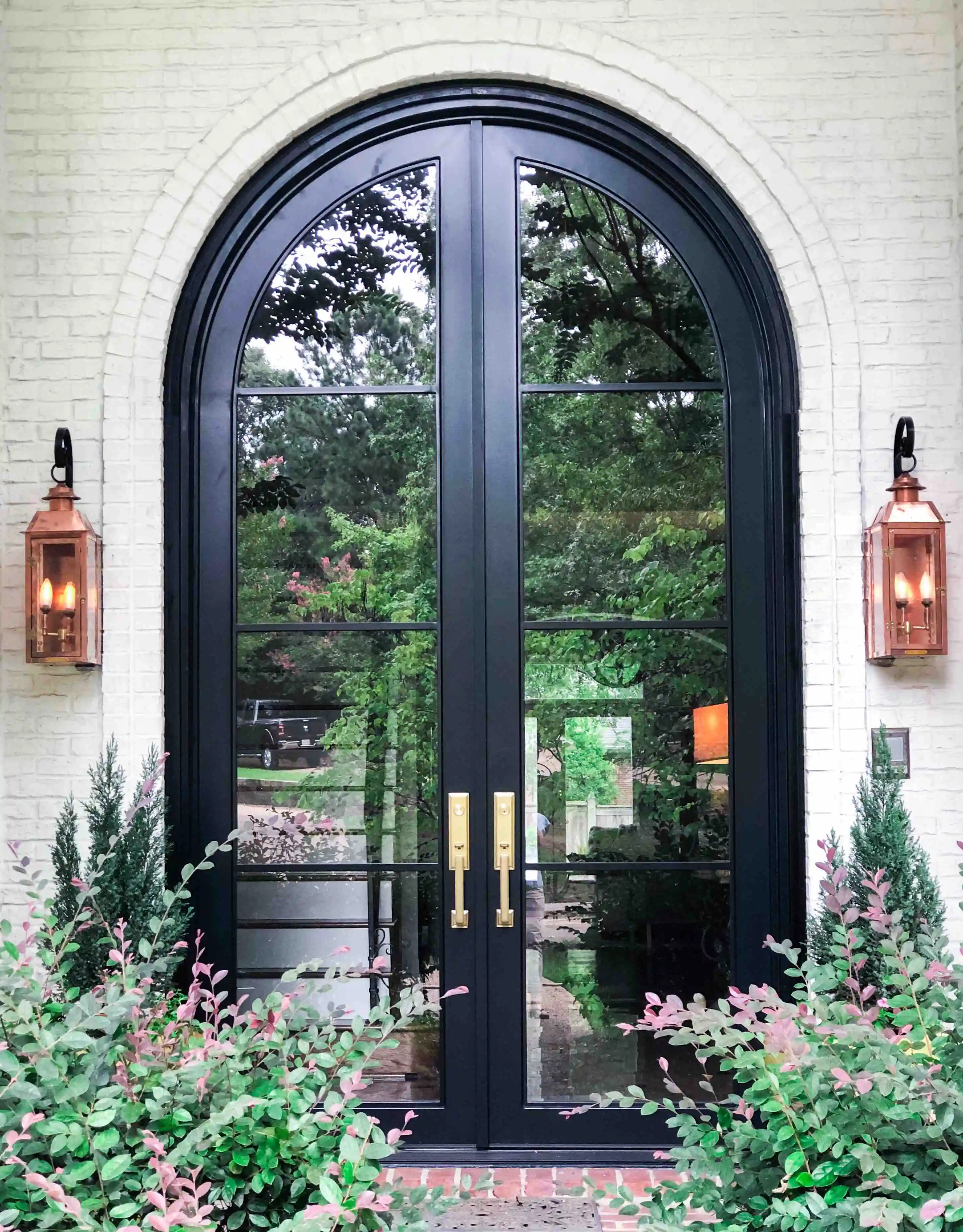
The right front door color does more than stand out from the street. It gives the entry a clear place in the architecture, connects the door to the home’s existing materials, and sets the mood before anyone crosses the threshold.
Start with the house, not a paint chip or a trend. Brick, stone, siding, roof color, window frames, porch shade, and the amount of glass in the door all change what a color will look like once it is installed. The goal is not to find a universally flattering shade. It is to choose a finish that makes the entry feel considered in its own setting.
Read the architecture before choosing a color
Think first about the role the door should play. Some homes need a strong focal point at the end of a long facade. Others already have a prominent porch, stone surround, or deep roofline, and the door needs to bring calm definition rather than compete. A darker door can anchor a pale elevation. A softer bronze or warm brown can make a formal entry feel less severe. A lighter finish can help a deeply recessed opening remain visible.
Look at the house from the street, then move closer. A color that reads beautifully from the curb can feel heavy at the threshold, especially when the entry is narrow or shaded. In the other direction, a quiet finish can feel elegant close up but disappear from the sidewalk. The right balance depends on distance, proportion, and the visual weight of the door itself.
Work with the materials that are not changing
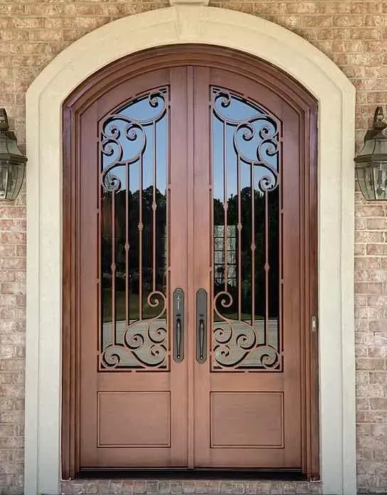
Start with the colors that are already fixed: roof shingles, brick, stone, siding, stucco, window frames, and concrete or pavers at the approach. These surfaces usually cover far more area than the door, so they set the palette. The front door should either create a measured contrast with those materials or echo one of their quieter undertones.
With red or warm brick, a dark charcoal, black, bronze, or dark brown door can give the masonry a clean edge without making the facade busy. Cooler gray stone often works with black, charcoal, or a restrained dark bronze. Homes with creamy stucco or light siding can carry a stronger contrast, but the trim and porch details should still keep the door from looking pasted on. Instead of matching one color exactly, look for finishes that share the same temperature: warm with warm, cooler with cooler.
If the home combines several materials, choose which one leads. The door may want to relate most closely to the roof, the dominant wall material, the window frames, or the metal lighting and railings. Trying to match everything at once usually produces a color that belongs nowhere in particular.
Check daylight, shade, and contrast at the real entry
Color changes in different light. A finish on a protected north-facing porch can look much darker than it does in a showroom. Direct afternoon sun can pull out warm undertones that were not obvious on a small sample. Exterior lighting and interior light through glass also affect the door after dark.
Take samples to the entry and look at them in morning, afternoon, and evening light. Hold them next to the trim, stone, brick, and threshold rather than against an indoor wall. Step back to the street and stand at the door. This small exercise quickly reveals whether a finish gives the opening enough presence, too much contrast, or not enough separation from the surrounding facade.
Choose the color and finish as one decision
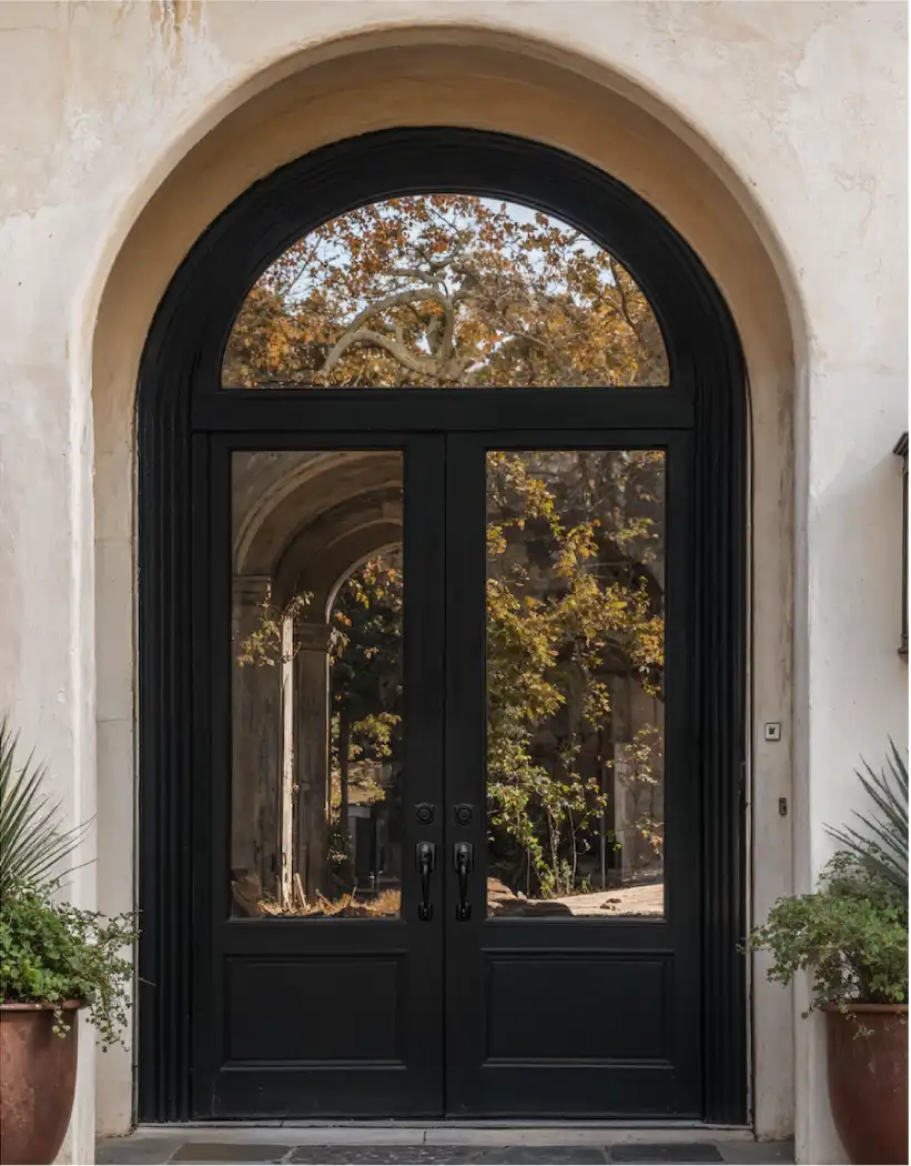
On an iron door, the finish does as much work as the color name. A near-black finish can feel crisp and contemporary with a clean profile and large panes of glass. The same color can feel more traditional when the door has an arch, divided lights, or decorative ironwork. Dark bronze can soften the contrast while keeping depth. Brown and wood-toned finishes can add warmth, especially on homes where the entry needs to connect to timber, brick, or earth-toned stone.
Consider the amount of detail in the door. A complex pattern or substantial ironwork often benefits from a quieter finish that lets the silhouette do the talking. A simpler door can carry a richer color or warmer tone because there is less competing visual information. This is also where the opening matters: a dark finish around clear glass can feel airy, while the same finish with privacy glass may read as more solid and formal.
For a custom wrought iron door, choose the finish alongside the configuration, glass, and panel layout. That gives the design one clear direction instead of treating color as the last decision after every other element is fixed.
Bring hardware, glass, and surrounding metal into the conversation
Door hardware has enough visual weight to shift how the color reads. A warm handle or knocker against a dark door can make the entry feel more traditional or tailored. Black hardware can keep the composition quiet. Nearby lanterns, house numbers, railings, and porch fixtures do not all need to match, but they should look as if they were chosen for the same house.
Glass matters too. Clear glass reflects the sky, landscaping, and interior light, so it can make a dark frame feel lighter at different times of day. Textured or privacy glass brings more visual density to the opening. If privacy is a priority, the front door glass privacy guide explains how to assess the sightlines before choosing the glass treatment.
Test a short list, then make the choice in context
Three options are usually enough. Choose one that blends with the home, one that offers a clear contrast, and one that sits between the two. Compare each against the exterior materials at different times of day. Photograph the samples from the street and beside the opening, because a photo often makes it easier to see the balance of the full facade.
- Set the job of the door. Decide whether the entry should anchor the front of the home, add warmth, introduce contrast, or quietly support stronger architectural details nearby.
- Gather the fixed materials. Photograph brick, stone, siding, roof, trim, porch flooring, and exterior fixtures in the same light where possible.
- Compare color temperature. Look for warm or cool undertones in the permanent materials before choosing a black, bronze, brown, or lighter finish.
- View the options from both distances. Check the color from the sidewalk and at the threshold, then return after dark if exterior lighting is part of the entry experience.
- Confirm the whole entry. Review glass, hardware, sidelights, and trim before finalizing the finish so no important element feels like an afterthought.
Plan the color as part of the full entry
The best front door color is not a formula. It is the one that supports the home’s architecture and feels right in daily use. A photo of the full facade, a view of the entry from inside, and a few references that show the mood you like are more useful than trying to name the perfect shade in isolation.
Luxury Iron Doors works with homeowners, builders, and designers to coordinate the door’s form, glass, finish, hardware preparation, and installation around the actual opening. Browse the door collection for starting points, explore custom options, and use the project gallery to see how a complete entry can change the front of a home.
Planning a custom entry
Give the finish a place in the whole design.
Share the exterior, a few starting dimensions, and the details you want the entry to carry. Luxury Iron Doors can help shape the door, glass, finish, and installation around the home.
Request a quoteFrequently asked questions
Should a front door match the trim?+
It can, but it does not have to. Matching the trim creates a quieter facade, while a contrasting door can give the entry more presence. The better choice depends on what the rest of the exterior is already doing.
What front door color works with red brick?+
Deep charcoal, black, softened bronze, and dark stained-wood tones often work well with red brick because they give the masonry room to remain the dominant color. Test samples against the brick and mortar in changing light before making the final selection.
Do black front doors work on every house?+
No. A black door can add definition to many facades, but on a shaded entry or a home with already-dark siding it can disappear. The amount of contrast, the surrounding trim, and the glass pattern matter as much as the color name.
Should the front door hardware match the door color?+
Hardware should feel intentional with the door, but it does not need to disappear into it. A darker finish can make the hardware quieter, while a warmer metal can create a point of contrast. Consider its scale, the nearby lighting, and the rest of the entry together.